Learning lexical scales: Review data

  1. Overview
  2. Data
    1. Columns
    2. Category sizes
    3. Word counts
  3. Word distributions
    1. Raw Count values are misleading
    2. A general plotting function
    3. Relative frequencies
    4. Probabilities
    5. A function for phrase frames
  4. Assessment methods
    1. Expected ratings
    2. Logistic regression
    3. Putting it together
  5. Methods for generating scales
    1. Values
    2. Creating scales
  6. Exercises

Overview

This section uses words — here, (string, pos) pairs — gathered from a large online collection of informal texts to try to build lexical scales of a sort that could be used for calculating scalar conversational implicatures. We start by figuring out how best to study word distributions, then look at two methods (expected ratings and logistic regression) for assessing and summarizing those distributions and, in turn, for creating scales from them.

Associated reading:

Code and data:

Data

The file imdb-words.csv consists of data gathered from the user-supplied reviews at the IMDB. I suggest that you take a moment right now to browse around the site a bit to get a feel for the nature of the reviews — their style, tone, and so forth.

The focus of this section is the relationship between the review authors' language and the star ratings they choose to assign, from the range 1-10 stars (with the exception of This is Spinal Tap, which goes to 11). Intuitively, the idea is that the author's chosen star rating affects, and is affected by, the text she produces. The star rating is a particular kind of high-level summary of the evaluative aspects of the review text, and thus we can use that high-level summary to get a grip on what's happening linguistically.

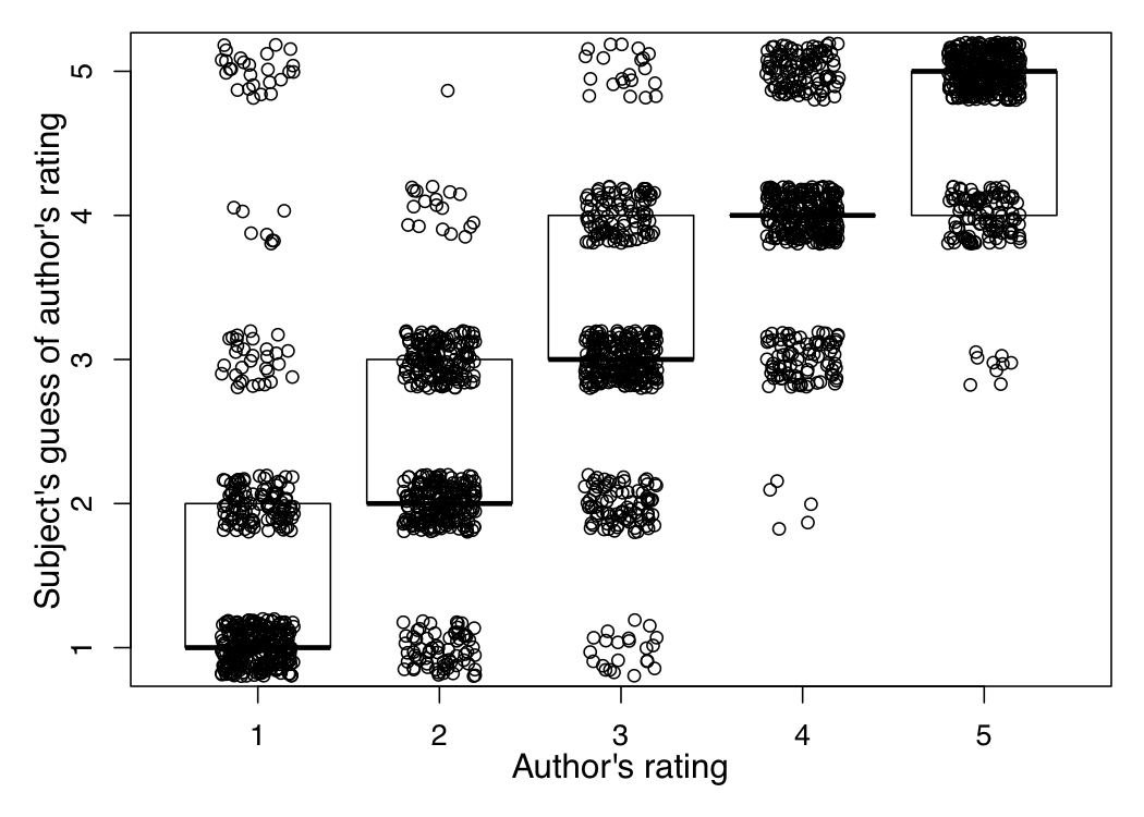
The star rating is primarily an indicator of the speaker/author vantage point. However, there is good reason to believe that readers/hearers are able to accurately recover the chosen star rating based on their reading of the text. Potts (2011) reports on an experiment conducted with Amazon's Mechanical Turk (Snow et al. (2008), Munro et al. (2011)) in which subjects were presented with 130-character reviews from OpenTable.com and asked to guess which rating the author of the text assigned (1-5 stars). Figure MTURK summarizes the results: the author's actual rating is on the x-axis, and the participants' guesses on the y-axis. The responses have been jittered around so that they don't lie atop each other. The plot also includes median responses (the black horizontal lines) and boxes surrounding 50% of the responses. The figure reveals that participants were able to guess with high accuracy which rating the author assigned; the median value is always the actual value, with nearly all subjects guessing within one star rating.

figures/reviews/mturk-reader-ratings.png
Figure MTURK
Experimental results suggesting that texts reliably convey to readers which star rating the author assigned.

In creating imdb-words.csv, I took a number of steps to get as close as possible to a set of linguistically respectable word-like objects:

  1. The texts were tagged using the Stanford Log-Linear Part-Of-Speech Tagger.
  2. The tags were then collapsed into the WordNet tags: a, n, v, r (adverb). Words whose tags were not part of those supercategories were filtered off.
  3. This smaller list of words was then stemmed using the high-precision WordNet tagger (accessible from the NLTK's ntk.stem.wordnet.WordNetLemmatizer class). This stemmer basically just removes inflectional morphology. For example, whereas (helps, v) and (helped, v) collapse to (help, v), (helpless, a) is left untouched. In addition, this stemmer always returns lexical items, unlike, for example, the Porter stemmer, which is very aggressive and often returns approximations of bound morphemes.

Columns

The column values for the file are as follows:

Since the file is in CSV (spreadsheet, tabular) format, it can be worked with using a variety of tools. This page uses R, for reasons discussed in the course overview.

First, move to the directory that contains the file and read it in:

  1. imdb = read.csv('imdb-words.csv')

The R head command displays the first n rows along with the header row. It's a useful way to make sure the data were read in correctly and to get a sense for the values (the first "word" in the file, (aa, n), is not especially word-like):

  1. head(imdb, n=10)
  2. Word Tag Category Count Total 1 aa n 1 38 25395214 2 aa n 2 15 11755132 3 aa n 3 29 13995838 4 aa n 4 10 14963866 5 aa n 5 10 20390515 6 aa n 6 43 27420036 7 aa n 7 78 40192077 8 aa n 8 94 48723444 9 aa n 9 87 40277743 10 aa n 10 114 73948447

Category sizes

Before we look at any words in detail, it is important to get a sense for what the overall distribution of the data is like. As noted above, the Total column values are the same for all words, repeated only to make tabular processing easier. Let's look at just those values:

  1. ## Get the first 10 rows, and just the Category and Total columns:
  2. totals = imdb[seq(1:10), c('Category', 'Total')]
  3. ## Look at the results:
  4. totals
  5. Category Total 1 1 25395214 2 2 11755132 3 3 13995838 4 4 14963866 5 5 20390515 6 6 27420036 7 7 40192077 8 8 48723444 9 9 40277743 10 10 73948447

Eyeballing these values, one can see that they have a rough J-shape. Plotting the data makes this even clearer:

  1. ## Basic plotting with no axes so that we can improve them:
  2. barplot(totals$Total, names.arg=totals$Category, main='IMDB total word counts', xlab='Category', ylab='Total (in millions)', axes=FALSE)
  3. ## Round to the nearest million for the y-axis labels:
  4. ylabs = round(totals$Total/1000000, 0)
  5. ## Display the actual values along the y-axis, rounded as above:
  6. axis(2, at=totals$Total, labels=ylabs, las=1)
figures/reviews/imdb-total.png
Figure TOTALS
The highly imbalanced category sizes.

Word counts

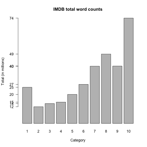
The total number of words represented is the row-count divided by 10, since each word gets ten rows. (If a word does not appear in a given Category, its Count value is 0 there.)

  1. ## nrow() returns the number of rows for its data.frame argument.
  2. nrow(imdb) / 10
  3. [1] 63104

The Total values represent true token counts for the entire corpus. As discussed above, I did a lot of winnowing of the data to create this file, so the Count sums don't match the Total values in the way one might expect. Compare the following values with those of figure TOTALS:

  1. ## xtabs creates contingency tables. Here we sum Count values by Category.
  2. subsetTotals = xtabs(Count ~ Category, data=imdb)
  3. subsetTotals
  4. Category 1 2 3 4 5 6 7 8 9 10 14175901 6603018 7890052 8472447 11567148 15597267 22844353 27662218 22761315 41432498

This is really just a reminder that we're looking at a subset of the data. Happily, the category sizes for our subset are proportional to the full totals we are working with, as is evident from plotting the two sets of totals side-by-side in a barplot:

  1. ## Create a matrix of the two totals vectors:
  2. m = matrix(c(totals$Total, subsetTotals), nrow=2, byrow=TRUE)
  3. ## Add intuitive labels:
  4. colnames(m) = totals$Category
  5. rownames(m) = c('Total', 'SubsetTotal')
  6. ## Generate the plot:
  7. barplot(m, names.arg=totals$Category, beside=TRUE, main='IMDB total word counts', xlab='Category', ylab='Total (in millions)', axes=FALSE, col=c('black', 'gray'))
  8. ## The left y-axis gets the Total values:
  9. total.ylabs = round(totals$Total/1000000, 0)
  10. axis(2, at=totals$Total, labels=total.ylabs, las=1, col='black')
  11. ## The right y-axis gets the SubsetTotal values:
  12. subtotal.ylabs = round(subsetTotals/1000000, 0)
  13. axis(4, at=subsetTotals, labels=subtotal.ylabs, las=1, col='gray')
  14. ## Plot legend. The first two arguments are position coordinates:
  15. legend(1, y=max(totals$Total), legend=c('Total', 'SubsetTotal'), fill=c('black', 'gray'))
figures/reviews/imdb-total-cmp.png
Figure TOTALCMP
The Total category sizes (repeated from figure TOTALS) alongside the sizes for the subset in imdb-words.csv. The overall distributions have the same shape.

Thus, we could work with either set of values, I'd say. Our sample seems to be unbiased with regard to the nature of the categories. (This is not a foregone conclusion; we might have accidentially filtered off more 1-star words than 10-star ones, for example. It looks like this didn't happen, though.) I work with the Total values from here on out, for conceptual simplicity.

Word distributions

This section builds towards a preferred method for studying the distribution of words across the rating categories. I illustrate with (bad, a). Let's start by reading in its subframe and having a look at it:

  1. ## Grab the subframe:
  2. bad = subset(imdb, Word=='bad' & Tag=='a')
  3. ## Have a look at it:
  4. bad
  5. Word Tag Category Count Total 37201 bad a 1 122232 25395214 37202 bad a 2 40491 11755132 37203 bad a 3 37787 13995838 37204 bad a 4 33070 14963866 37205 bad a 5 39205 20390515 37206 bad a 6 43101 27420036 37207 bad a 7 46696 40192077 37208 bad a 8 42228 48723444 37209 bad a 9 29588 40277743 37210 bad a 10 51778 73948447

Raw Count values are misleading

As we saw above, the raw Count values are likely to be misleading due to the very large size imbalances among the categories. For example, there are more tokens of (bad, a) in 10-star reviews than in 2-star ones, which seems highly counter-intuitive. Plotting the values reveals that the Count distribution is very heavily influenced by the overall distribution of words:

  1. ## Plot with type='b' to show both the data points and lines connecting them:
  2. plot(bad$Category, bad$Count, main='Counts of (bad, a) in IMDB', xlab='Category', ylab='Count', pch=19, type='b', axes=FALSE)
  3. axis(1, at=bad$Category)
  4. axis(2, at=bad$Count, las=1)
figures/reviews/imdb-bad-counts.png figures/reviews/imdb-total.png
Figure COUNTS
Count distribution for (bad, a) (left) and the overall category size (right; repeated from figure TOTALS). The distribution is heavly influenced by the category sizes.

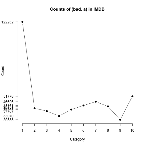
The source of this odd picture is clear: the 10-star category is 7 times bigger than the 1-star category, so the absolute counts do not necessarily reflect the rate of usage.

A general plotting function

Before moving on to more useful measures, I want to pause to create a general function for plotting that is more useful than the defaults provided by R. In particular, I would like to follow the advice of Tufte (2006): the axis labels will be actual values from the data, displayed intuitively:

  1. ## This function does a basic plot of the sort that we will
  2. ## want to do a lot, with Tufte-inspired axis labels.
  3. ## Arguments:
  4. ## x: the x-axis data vector
  5. ## y: the y-axis data vector
  6. ## digits: rounding for the y-axis (default: 2)
  7. ## ylim: limits for the y-axis, as a vector (default: c(min(y), max(y)))
  8. ## log: log-scale axis (default: '' means no log-scale; options are y, x, xy)
  9. ## main: a string to use as the main (plot title) argument (default: '')
  10. ## xlab: a string to label the x-axis (default: 'Category')
  11. ## ylab: a string to label the y-axis (default: '')
  12. WordPlot = function(x, y, digits=2, ylim=c(min(y), max(y)), log='', main='', xlab='Category', ylab=''){
  13. plot(x, y, ylim=ylim, log=log, main=main, xlab=xlab, ylab=ylab, pch=19, type='b', axes=FALSE)
  14. axis(1, at=x)
  15. axis(2, at=y, labels=round(y, digits), las=1)
  16. }

Using this function, you can recreate the left panel in figure COUNTS:

  1. WordPlot(bad$Category, bad$Count, digits=0, main='Counts of (bad, a) in IMDB', ylab='Count')

Relative frequencies

To get relative frequency values, we divide the Count values by the corresponding Total values. The following command adds these values as the rightmost column in our bad subframe:

  1. ## Add the column of relative frequency values to the bad subframe.
  2. bad$RelFreq = bad$Count / bad$Total
  3. ## View the results.
  4. bad
  5. Word Tag Category Count Total RelFreq 37201 bad a 1 122232 25395214 0.0048131904 37202 bad a 2 40491 11755132 0.0034445381 37203 bad a 3 37787 13995838 0.0026998741 37204 bad a 4 33070 14963866 0.0022099904 37205 bad a 5 39205 20390515 0.0019227077 37206 bad a 6 43101 27420036 0.0015718798 37207 bad a 7 46696 40192077 0.0011618210 37208 bad a 8 42228 48723444 0.0008666875 37209 bad a 9 29588 40277743 0.0007345993 37210 bad a 10 51778 73948447 0.0007001905

Relative frequency values are hard to get a grip on intuitively because they are so small. Plotting helps bring out the relationships between the values:

  1. WordPlot(bad$Category, bad$RelFreq, main='RelFreq (log-scale) of (bad, a) in IMDB', ylab='', digits=5, log='y')
figures/reviews/imdb-bad-relfreq.png figures/reviews/imdb-bad-counts.png
Figure RELFREQ
RelFreq distribution for (bad, a) (left), alongside the Count distribution (right; repeated from figure COUNTS). RelFreq values show little or no influence from the underlying category sizes.

RelFreq values seem to bring out important usage patterns. The imbalances in the size of the underlying categories seem to have disappeared. (However, see Baayen 2001 for detailed disussion of how corpus size can affect word distributions, though most of the concerns relate to vocabulary size.)

One drawback to RelFreq values is that they are highly sensitive to overall frequency. For example, (bad, a) is significantly more frequent than (horrible, a), which means that the RelFreq values for the two words are hard to directly compare. The following code attempts to do that, by putting them side-by-side and stretching the y-axis enough to include all of the values for both of them:

  1. ## Set-up 'horrible' as we did for 'bad':
  2. horrible = subset(imdb, Word=='horrible' & Tag=='a')
  3. horrible$RelFreq = horrible$Count / horrible$Total
  4. ## Determine appropriate common y-axis limits:
  5. yvals = c(bad$RelFreq, horrible$RelFreq)
  6. ylims = c(min(yvals), max(yvals))
  7. ## Set up a double-panel plot window:
  8. par(mfrow=c(1,2))
  9. ## Plots:
  10. WordPlot(bad$Category, bad$RelFreq, main='RelFreq (log-scale) for (bad, a) in IMDB', ylab='', ylim=ylims, digits=5, log='y')
  11. WordPlot(horrible$Category, horrible$RelFreq, main='RelFreq (log-scale) for (horrible, a) in IMDB', ylab='', ylim=ylims, digits=5, log='y')
figures/reviews/imdb-bad-horrible-relfreq.png
Figure RELFREQ
Comparing words via their RelFreq distributions.

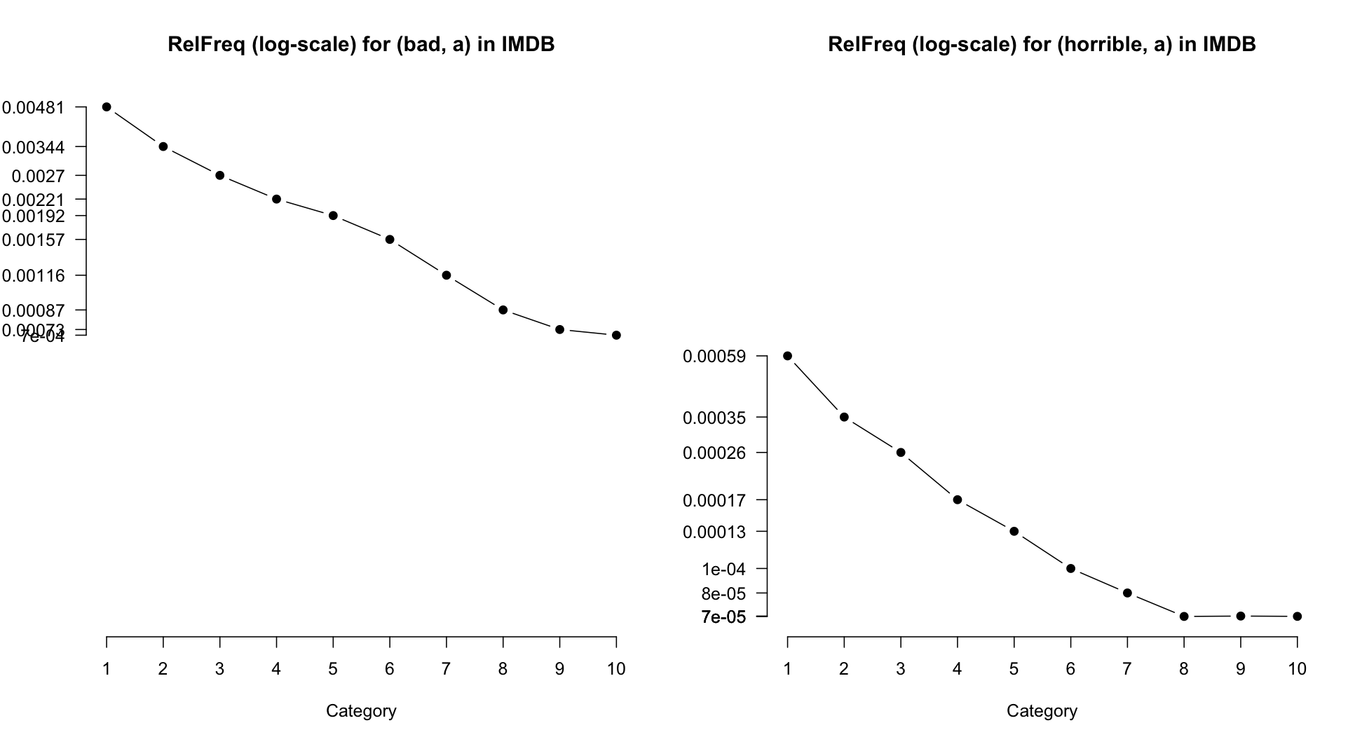
It is, I think, possible to discern that (bad, a) is less extreme in its negativity than (horrible, a). However, the effect looks subtle. The next measure we look at abstracts away from overall frequency, which facilitates this kind of direct comparison.

Probabilities

A drawback to RelFreq values, at least for present purposes, is that they are extremely sensitive to the overall frequency of the word in question. There is a comparable value that is insensitive to this quantity:

  1. bad$Pr = bad$RelFreq / sum(bad$RelFreq)
  2. bad
  3. Word Tag Category Count Total RelFreq Pr 37201 bad a 1 122232 25395214 0.0048131904 0.23915905 37202 bad a 2 40491 11755132 0.0034445381 0.17115310 37203 bad a 3 37787 13995838 0.0026998741 0.13415204 37204 bad a 4 33070 14963866 0.0022099904 0.10981058 37205 bad a 5 39205 20390515 0.0019227077 0.09553600 37206 bad a 6 43101 27420036 0.0015718798 0.07810397 37207 bad a 7 46696 40192077 0.0011618210 0.05772886 37208 bad a 8 42228 48723444 0.0008666875 0.04306419 37209 bad a 9 29588 40277743 0.0007345993 0.03650096 37210 bad a 10 51778 73948447 0.0007001905 0.03479125

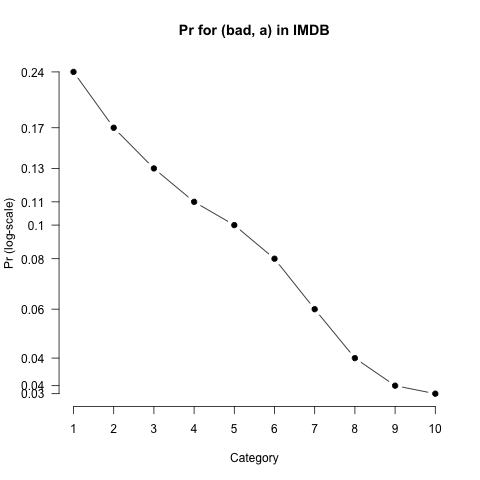
Pr values are just rescaled RelFreq values: we divide by a constant to get from RelFreq to Pr. As a result, the distributions have exactly the same shape; compare the following with figure RELFREQ:

  1. WordPlot(bad$Category, bad$Pr, main='Pr for (bad, a) in IMDB', ylab='Pr (log-scale)', log='y')
figures/reviews/imdb-bad-pr.png figures/reviews/imdb-bad-relfreq.png
Figure PR
Comparing Pr values (left) with RelFreq values (right; repeated from figure RELFREQ). The shapes are exactly the same (Pr is a rescaling of RelFreq).

A technical note: The move from RelFreq to Pr actually involves an application of Bayes Rule.

  1. RelFreq values can be thought of as estimates of the conditional distribution P(word|rating): given that I am in rating category rating, how likely am I to produce word?
  2. Bayes Rule allows us to obtain the inverse distribution P(rating|word):
    P(rating|word) = P(word|rating)P(rating) / P(word)
  3. However, we would not want to directly apply this rule, because of the term P(rating) in the numerator. That would naturally be approximated by the distribution given by Total, as in figure TOTALS, which would simply re-introduce all of those unwanted biases.
  4. Thus, we keep P(rating) constant, which is just to say that we leave it out:
    P(word|rating) / P(word)
    where P(word) = sum(RelFreq).

Pr values greatly facilitate comparisons between words:

  1. ## Add Pr values for 'horrible':
  2. horrible$Pr = horrible$RelFreq/sum(horrible$RelFreq)
  3. ## Determine appropriate common y-axis limits:
  4. yvals = c(bad$Pr, horrible$Pr)
  5. ylims = c(min(yvals), max(yvals))
  6. ## Set up a double-panel plot window:
  7. par(mfrow=c(1,2))
  8. ## Plots:
  9. WordPlot(bad$Category, bad$Pr, main='Pr for (bad, a) in IMDB', ylab='Pr (log-scale)', ylim=ylims, log='y')
  10. WordPlot(horrible$Category, horrible$Pr, main='Pr for (horrible, a) in IMDB', ylab='Pr (log-scale)', ylim=ylims, log='y')
figures/reviews/imdb-bad-horrible-pr.png
Figure BHPR
Comparing the Pr distributions of (bad, a) and (horrible, a). The comparision is easier than it was with RelFreq values (figure RELFREQ).

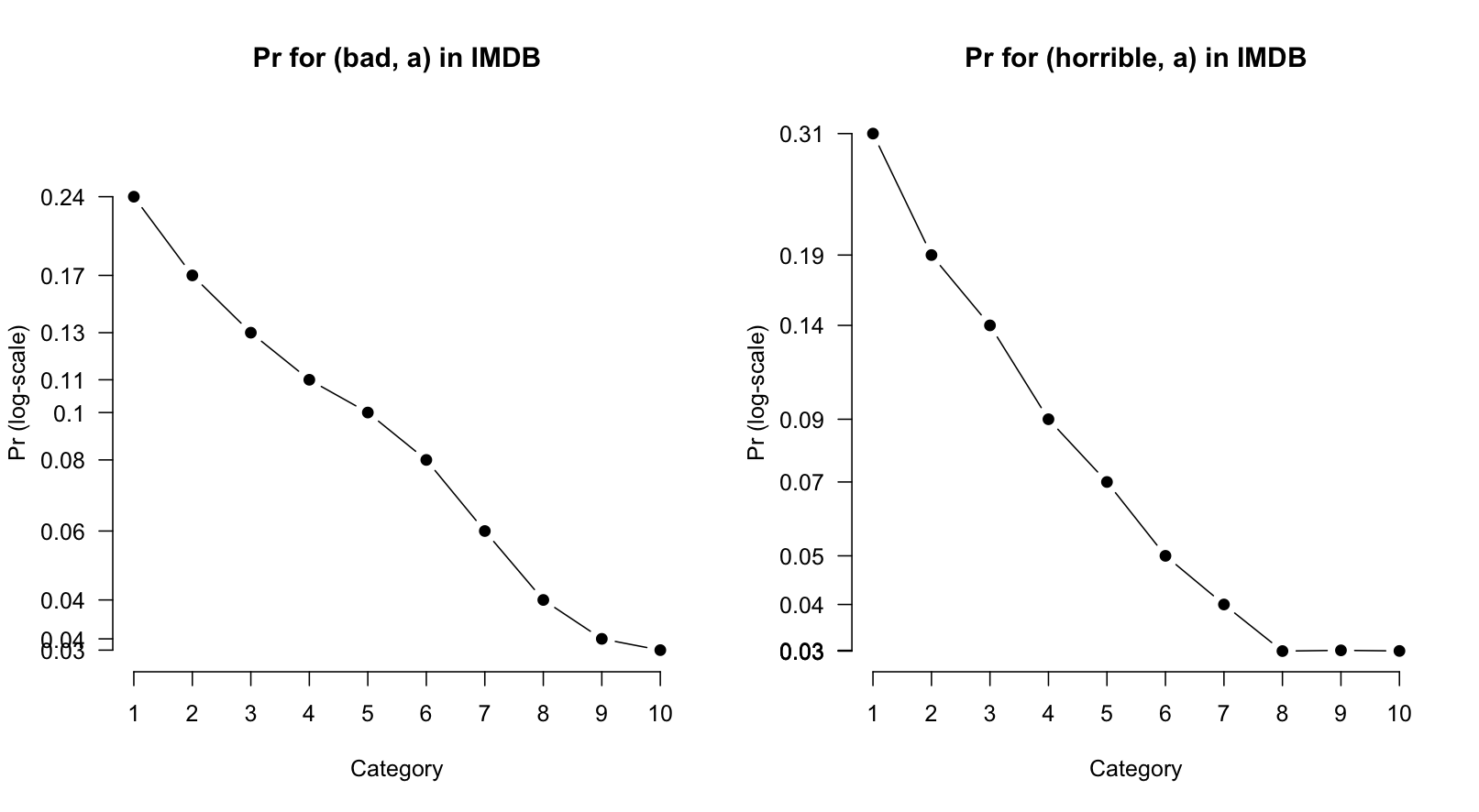
I think these plots clearly convey that (bad, a) is less intensely negative than (horrible, a). For example, whereas (bad, a) is at least used throughout the scale, even at the top, (horrible, a) is effectively never used at the top of the scale.

A function for word frames

It's useful to pause at this point to generalize the process of grabbing a word's phrase frame and adding RelFreq and Pr values:

  1. ## Get the subframe for a word and add RelFreq and Pr values.
  2. ## Arguments:
  3. ## df: a data-frame in the format of imdb-words.csv
  4. ## word: any string
  5. ## tag: any string (but should be a, n, r, or v)
  6. ## Value: the word frame with new distribution values.
  7. WordFrame = function(df, word, tag){
  8. pf = subset(df, Word==word & Tag==tag)
  9. ## Exit if the word isn't in df:
  10. if(nrow(pf)==0){
  11. print(paste('Ack: (', word, ',', tag, ') not in database', sep=''))
  12. return()
  13. }
  14. ## Add the values:
  15. pf$RelFreq = pf$Count / pf$Total
  16. pf$Pr = pf$RelFreq / sum(pf$RelFreq)
  17. ## Return the augmented frame:
  18. return(pf)
  19. }

Assessment methods

This section develops two methods for studying the distributions more closely, moving beyond impressions based on plots to get at some more objective measures of what the distributions are like and how confident we can be that they meaningfully reflect usage patterns (as opposed to being just quirks traceable to low overall frequency, quirks in the data, etc.).

Expected ratings

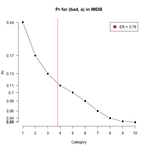
Expected ratings calculations are used by de Marneffe et al. 2010 to summarize Pr-based distributions. The expected rating calculation is just a weighted average of Pr values.

  1. badEr = sum(bad$Category * bad$Pr)

To get a feel for these values, it helps to work through a couple examples. In the first, we assume that 100% of the tokens of the word in question are in the 10 star review:

  1. ## Example 1
  2. ## Suppose the word occurs only in 10-star reviews:
  3. pr = c(0,0,0,0,0,0,0,0,0,1)
  4. ## The Categories are as usual:
  5. cats = seq(1,10)
  6. cats
  7. [1] 1 2 3 4 5 6 7 8 9 10
  8. ## The multiplication step:
  9. x = pr * cats
  10. x
  11. [1] 0 0 0 0 0 0 0 0 0 10
  12. ## The summation step:
  13. sum(x)
  14. 10

In the next example, we add some tokens to the middle of the scale:

  1. ## Example 2
  2. ## Suppose we add a little mass to the 5-star category:
  3. pr = c(0,0,0,0, 0.2, 0,0,0,0, 0.8)
  4. ## The multiplication step:
  5. x = pr * cats
  6. x
  7. [1] 0 0 0 0 1 0 0 0 0 8
  8. ## The ER was dragged down a bit by the mass at 5-stars:
  9. sum(x)
  10. 9

The following code adds the ER value to our plots (bad, a) Pr plot:

  1. WordPlot(bad$Category, bad$Pr, main='Pr for (bad, a) in IMDB', ylab='Pr')
  2. abline(v=badEr, col='red')
  3. ## The first two arguments to legend are x,y coordinates for placement.
  4. ## The third is the text itself.
  5. legend(8, y=max(bad$Pr), paste('ER =', round(badEr,2)), fill='red')
figures/reviews/imdb-bad-er.png
Figure ER
The (bad, a) Pr plot with added expected rating.

We will use expected ratings later, as one method for building scales, so here is a general utility for creating them from a word's phrase frame:

  1. ## Expected ratings for words.
  2. ## Argument:
  3. ## pf: a phrase frame produced by WordFrame
  4. ## Value: The expected rating for pf
  5. ExpectedRating = function(pf){
  6. sum(pf$Category * pf$Pr)
  7. }

Logistic regression

Expected ratings are easy to calculate and quite intuitive, but it is hard to know how confident we can be in them, because they are insensitive to the amount and kind of data that went into them. Suppose the ER for words v and w are both 10, but we have 500 tokens of v and just 10 tokens of w. This suggests that we can have a high degree of confidence in our ER for v, but not for w. However, ER values don't encode this uncertainty, nor is there an obvious way to capture it.

Logistic regression provides a useful way to do the work of ERs but with the added benefits of having a model and associated test statistics and measures of confidence. For our purposes, we can stick to a simple model that uses Category values to predict word usage. The intuition here is just the one that we have been working with so far: the star-ratings are correlated with the usage of some words. For a word like (bad, a), the correlation is negative: usage drops as the ratings get higher. For a word like (amazing, a), the correlation is positive. (You can check this quickly using WordFrame to build the frame and WordPlot to plot the associated RelFreq or Pr values.)

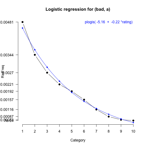
With our logistic regression models, we will essentially fit lines through our RelFreq data points, just as one would with a linear regression involving one predictor. However, the logistic regression model fits these values in log-odds space and uses the inverse logit function (plogis in R) to ensure that all the predicted values lie in [0,1], i.e., that they are all true probability values. Unfortunately, there is not enough time to go into much more detail about the nature of this kind of modelling. I refer to Gelman and Hill  2008, §5-6 for an accessible, empirically-driven overview. Instead, let's simply fit a model and try to build up intuitions about what it does and says:

  1. badFit = glm(cbind(bad$Count, bad$Total-bad$Count) ~ Category, family=quasibinomial, data=bad)

Here, we use R's glm (generalized linear model) function to predict log-odds values based on Category. The expression cbind(bad$Count, bad$Total-bad$Count) is used internally by glm to derive the log-odds distribution. Category is our usual vector star ratings.

Let's begin by inspecting the coefficients for this fit:

  1. badFit$coef
  2. (Intercept) Category -5.1625218 -0.2228004

We can also plot the model in log-odds space:

  1. ## Add log-odds values:
  2. bad$LogOdds = log(bad$Count / (bad$Total-bad$Count))
  3. ## Plot the log-odds values:
  4. WordPlot(bad$Category, bad$LogOdds, main='Log-odds for (bad, a)', ylab='Log-odds')
  5. ## Add the model fit to the plot:
  6. curve(badFit$coef[1] + badFit$coef[2]*x, col='blue', add=TRUE)
figures/reviews/imdb-bad-logodds.png
Figure LOGODDS
Log-odds distribution with associated model fit.

It also helps intuitions to calculate some sample values and compare them to the empirical log-odds that we added to the frame.

  1. rating = 1
  2. -5.1625218 + (-0.2228004*rating)
  3. [1] -5.385322 ## Empirical = -5.331570
  4. rating = 5
  5. -5.1625218 + (-0.2228004*rating)
  6. [1] -6.276524 ## Empirical = -6.252096
  7. rating = 10
  8. -5.1625218 + (-0.2228004*rating)
  9. [1] -7.390526 ## Empirical = -7.263458

Log-odds values are notoriously hard to interpret. It is more intuitive to think about what is happening in probability space. To do this, we apply the inverse logit function to the model estimates:

  1. rating = 1
  2. plogis(-5.1625218 + (-0.2228004*rating))
  3. [1] 0.004562452 ## Empirical = 0.0048131904
  4. rating = 5
  5. plogis(-5.1625218 + (-0.2228004*rating))
  6. [1] 0.001876397 ## Empirical = 0.0019227077
  7. rating = 10
  8. plogis(-5.1625218 + (-0.2228004*rating))
  9. [1] 0.0006166909 ## Empirical = 0.0007001905

R actually provides these fitted values. The default way they display isn't great (try badFit$fitted), so let's add them directly to our frame:

  1. ## Fitted values for our model:
  2. bad$Fitted = badFit$fitted
  3. bad
  4. bad
  5. Word Tag Category Count Total RelFreq Pr LogOdds Fitted 37201 bad a 1 122232 25395214 0.0048131904 0.23915905 -5.331570 0.0045624517 37202 bad a 2 40491 11755132 0.0034445381 0.17115310 -5.667515 0.0036545440 37203 bad a 3 37787 13995838 0.0026998741 0.13415204 -5.911847 0.0029267748 37204 bad a 4 33070 14963866 0.0022099904 0.10981058 -6.112555 0.0023435932 37205 bad a 5 39205 20390515 0.0019227077 0.09553600 -6.252096 0.0018763963 37206 bad a 6 43101 27420036 0.0015718798 0.07810397 -6.453910 0.0015021951 37207 bad a 7 46696 40192077 0.0011618210 0.05772886 -6.756604 0.0012025293 37208 bad a 8 42228 48723444 0.0008666875 0.04306419 -7.049965 0.0009625847 37209 bad a 9 29588 40277743 0.0007345993 0.03650096 -7.215451 0.0007704802 37210 bad a 10 51778 73948447 0.0007001905 0.03479125 -7.263458 0.0006166906

Let's put all this together into the most information rich, intuitive plot we can muster:

  1. ## Plot the RelFreq values:
  2. WordPlot(bad$Category, bad$RelFreq, main='Logistic regression for (bad, a)', ylab='RelFreq', digits=5)
  3. ## Add the fitted values:
  4. points(bad$Category, bad$Fitted, col='blue', pch=18)
  5. ## Interpolate a curve through the fitted values:
  6. curve(plogis(badFit$coef[1] + badFit$coef[2]*x), col='blue', add=TRUE)
  7. ## Model information:
  8. text(8, max(bad$RelFreq), paste('plogis(', round(badFit$coef[1], 2), ' + ', round(badFit$coef[2], 2), '*rating)'), col='blue')
figures/reviews/imdb-bad-logit.png
Figure LOGIT
RelFreq view of (bad, a) with logistic regression.

There is one more ingredient to add: p-values. To see the p-values for the model:

  1. summary(badFit)$coef
  2. Estimate Std. Error t value Pr(>|t|) (Intercept) -5.1625218 0.045893962 -112.48804 4.358921e-14 Category -0.2228004 0.007969772 -27.95569 2.894226e-09

These provide us with an estimate of how much confidence we can have in our model. You can extract them from the above table with summary(badFit)$coef[1,4] (for the intercept) and summary(badFit)$coef[2,4] (for the Category coefficient). We aren't concerned here with the Intercept value, so let's define a function that extracts the Category p-value and also delivers it in a format suitable for printing:

  1. ## Prevent R from printing '0' for a p value, which is impossible.
  2. ## Input: a model fit produced by WordLogit.
  3. ## Output: a string representing the p value as an equality or inequality (if it is tiny).
  4. ExtractPrintableP = function(fit){
  5. p = summary(fit)$coef[2,4]
  6. pp = ''
  7. if (p < 0.001){ pp = 'p < 0.001' }
  8. else { pp = paste('p =', round(p, 3)) }
  9. return(pp)
  10. }

To round out this section, let's define a general method for fitting our simple logistic regression:

  1. ## Fit a model for a word's frame.
  2. ## Argument: a phrase frame of the sort produced by WordFrame
  3. ## Output: the fitted model
  4. WordLogit = function(pf){
  5. fit = glm(cbind(pf$Count, pf$Total-pf$Count) ~ Category, family=quasibinomial, data=pf)
  6. return(fit)
  7. }

Putting it together

We would like a function that allows us to visualize the Pr values of words really quickly, given one of the data sets:

  1. ## Arguments:
  2. ## df: a dataframe like imdb
  3. ## word: any string
  4. ## tag: any string, but should be one of a, n, v, r
  5. ## ylim: allows the user to specify the y-axis limits (default: c(0, 0.3))
  6. WordDisplay = function(df, word, tag, ylim=c(0,0.3)){
  7. pf = WordFrame(df, word, tag)
  8. ## Basic plotting:
  9. title = paste('(', word, ',', tag, ') -- ', sum(pf$Count), ' tokens', sep= '')
  10. WordPlot(pf$Category, pf$Pr, main=title, ylim=ylim)
  11. ## Get the expected rating:
  12. er = ExpectedRating(pf)
  13. abline(v=er, col='red')
  14. ## Try to avoid having the text we add overlap the data:
  15. textx = 10
  16. textpos = 2
  17. if(max(er > 6)){ textx = 1; textpos=4 }
  18. text(textx, max(ylim), paste('ER = ', round(er,2), sep=''), col='red', pos=textpos)
  19. ## Fit the model:
  20. fit = WordLogit(pf)
  21. ## Add the fitted values:
  22. points(fit$fitted/sum(pf$RelFreq), col='blue', pch=18)
  23. ## Interpolate a curve through the fitted values.
  24. curve(plogis(fit$coef[1] + fit$coef[2]*x)/sum(pf$RelFreq), col='blue', add=TRUE)
  25. ## The text annotation.
  26. pp = ExtractPrintableP(fit)
  27. text(textx, max(ylim)*0.9, paste('Category coef. = ', round(fit$coef[2], 2), ' (', pp, ')', sep=''), col='blue', pos=textpos)
  28. }

To close some comparisons that help to bring out how the coefficients and p-values might be useful as a filter:

  1. par(mfrow=c(1,3))
  2. WordDisplay(imdb, 'awful', 'a', ylim=c(0,0.35))
  3. WordDisplay(imdb, 'great', 'a', ylim=c(0,0.35))
  4. WordDisplay(imdb, 'aardvark', 'n', ylim=c(0,0.35))
figures/reviews/imdb-awful-great-aardvark.png
Figure COMPARE
Comparing words using our assessment values.

Methods for generating scales

Values

We can use the ER and logistic regression values to order all the lexical items. First, let's create a separate table containing just the ER value, Category coefficient, and Category p value for each word in the vocabulary. To do this efficiently, I first define an auxiliary function that, given a word's frame, gets these values for us:

  1. ## This subfunction calculates assesment values for a word based on a subframe.
  2. ## Argument: A Word's subframe directly from the main CSV source file.
  3. ## (Pr and RelFreq are added as part of this function.)
  4. ## Value: a vector (er, coef, coef.p).
  5. WordAssess = function(pf){
  6. ## Build up the subframe as usual:
  7. pf$RelFreq = pf$Count/pf$Total
  8. pf$Pr = pf$RelFreq / sum(pf$RelFreq)
  9. ## ER value.
  10. er = ExpectedRating(pf)
  11. ## Logit and the coefficient values. (We don't need the intercept values.)
  12. fit = WordLogit(pf)
  13. coef = fit$coef[2]
  14. coef.p = summary(fit)$coef[2,4]
  15. ## Return a vector of assessment values, which ddply will add to its columns:
  16. return(cbind(er, coef, coef.p))
  17. }

The function ddply from the plyr library efficiently handles grouping words (based on WordTag identity) and sending those subframes to WordAssess for the needed values, then adding them to a data.frame:

  1. ## Load the library for the ddply function.
  2. library(plyr)
  3. VocabAssess = function(df){
  4. ## ddply takes care of grouping into words and
  5. ## then applying WordAssess to those subframes.
  6. ## It will also display a textual progress bar.
  7. vals = ddply(df, c('Word', 'Tag'), WordAssess, .progress='text')
  8. ## Add intuitive column names.
  9. colnames(vals) = c('Word', 'Tag', 'ER', 'Coef', 'P')
  10. return(vals)
  11. }

It will take your computer a long time to generate the ER values for either of these large files. For safety, save to a file so that you can use it later:

  1. imdbAssess = VocabAssess(imdb)
  2. write.csv(imdbAssess, 'imdb-words-assess.csv', row.names=FALSE)

Here's a link to my version of this assessment file:

Creating scales

Only a small percentage of the words in the vocabulary meet the 0.001 significance threshold:

  1. ## Create subframes of significant and non-significant words:
  2. sig = subset(imdbAssess, P < 0.001)
  3. nonsig = subset(imdbAssess, P >= 0.001)
  4. ## See how discriminating the threshold is:
  5. nrow(sig)
  6. [1] 5622
  7. nrow(nonsig)
  8. [1] 57482
  9. nrow(sig) / nrow(imdbAssess)
  10. [1] 0.08909102

The coefficient values and ERs are intimately related:

  1. ## Outliers make the full plot hard to read.
  2. plot(imdbAssess$ER, imdbAssess$Coef, pch=20)
  3. points(sig$ER, sig$Coef, pch=20, col='green')
  4. ## Zoom in:
  5. plot(imdbAssess$ER, imdbAssess$Coef, pch=20, ylim=c(-2,2))
  6. points(sig$ER, sig$Coef, pch=20, col='green')
  7. legend(2, 2, 'Significant', fill='green')
figures/reviews/imdb-er-coef.png
Figure ERCOEF
Relating ERs to coefficients.

The significant subset seems of most interest, since we can count on its estimates more. A first thing to notice about it is that its distribution relative to categories is different from that of the larger population, presumably because some categories are more scalar, in the requisite sense, than others.

  1. sigDist = xtabs(~ sig$Tag)/nrow(sig)
  2. imdbAssessDist = xtabs(~ imdbAssess$Tag)/nrow(imdbAssess)
  3. m = matrix(c(imdbAssessDist, sigDist), nrow=2, byrow=TRUE)
  4. rownames(m) = c('Full', 'Sig')
  5. colnames(m) = c('a', 'n', 'r', 'v')
  6. ## Add a little extra space to the right to accommodate labels there.
  7. par(mar=c(5, 4, 4, 4) + 0.1)
  8. barplot(m, main='Full dist compared with sig. subset', beside=TRUE, axes=FALSE, legend=TRUE)
  9. axis(2, at=imdbAssessDist, labels=round(imdbAssessDist, 2), las=1)
  10. axis(4, at=sigDist, labels=round(sigDist, 2), las=1, col='gray')
figures/reviews/imdb-tagdist-cmp.png
Figure TAGDIST
Distribution of tags in the significant subset and in the full vocabulary.

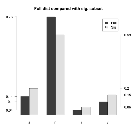
Since scalar comparisons are likely to be between items of the same category, it seems smart to limit attention to specific categories. Let's check out the adjectives, which have poor coverage in the WordNet hierarchy:

  1. a = subset(sig, Tag=='a')
  2. a = a[order(a$Coef), ]
  3. head(a, 20)[ , c('Word', 'ER', 'Coef')]
  4. Word ER Coef 58612 unfunniest 2.013389 -0.6582459 3438 avoid 2.393120 -0.5346832 53241 stinker 2.513412 -0.4510868 6596 braindead 2.680215 -0.4480195 53678 stunk 2.703793 -0.4439793 58678 unimaginitive 2.600913 -0.4366011 40239 overestimated 2.806352 -0.4293779 54382 suspenseless 3.008162 -0.4232574 47504 rubbishy 2.506787 -0.4200947 58190 unclever 2.828458 -0.4157907 6340 borefest 2.679231 -0.4139886 12052 crappier 2.675727 -0.4029694 39321 offal 2.606780 -0.3984035 12060 craptastic 2.728813 -0.3977646 12054 crappiest 2.669730 -0.3921581 21679 gawdawful 2.769799 -0.3902551 58613 unfunny 2.954844 -0.3858909 45499 redeeming 2.928084 -0.3830881 58497 unentertaining 2.928676 -0.3806702 32544 lobotomized 2.898316 -0.3765344
  5. tail(a, 20)[ , c('Word', 'ER', 'Coef')]
  6. Word ER Coef 54128 superb 7.702853 0.3033280 41855 phenomenal 7.518168 0.3059820 45914 remastered 7.611093 0.3064188 33567 magnificient 7.731553 0.3118090 56265 timeless 7.530968 0.3132090 25815 hooked 7.646278 0.3297160 19985 flawless 7.773292 0.3341107 58793 unmatched 7.690208 0.3371698 58585 unforgettable 7.827416 0.3473440 59071 unsurpassed 7.657241 0.3509939 17378 enchanting 8.050419 0.3628247 24652 heartbreaking 8.016746 0.3765169 35478 mesmerizing 8.151436 0.3844013 58290 underated 8.014425 0.3943638 13821 delorean 8.157941 0.4043632 58411 undeservedly 8.539708 0.4062378 44910 ran 8.120743 0.4268429 37061 moving 8.220502 0.4525662 58584 unforgetable 8.538467 0.5552966 23392 groundhog 9.083772 0.6264243

These lists look pretty good. There is some influence of the underlying domain, but that could perhaps be weeded out via other resources. See the exercises for more on that.

Exercises

REVIEWLEVEL The following data-frame gives some review-level information for the IMDB corpus:

Read it in and then: (i) create a barplot of the review sizes, (ii) create a percentage-wise barplot that gives the review counts and the word counts side-by-side, and (iii) plot the average word counts relative to the categories. For each plot, give the commands you used as well as a few sentences summarizing what useful conclusions we might draw from the plots (things we might keep in mind when doing analysis.

PREX In creating the Pr estimates, I applied Bayes Rule under the assumption of a uniform prior. What happens if we include the prior information? For this, you can use the following counts of reviews to calculate Pr(rating), the probabilities for the rating categories. (This problem can be done with supplementary R code, or just in prose and math.)

  1. reviewCounts = c(124587, 51390, 58051, 59781, 80487, 106145, 157005, 195378, 170531, 358441)

REGEX It's often useful to be able to group words by regular expression. The following function will do this, using grepl:

  1. RegexSearch = function(df, regex){
  2. results = subset(df, grepl(regex, df$Word))
  3. return(results)
  4. }

Modify and extend WordFrame so that the user can add the optional keyword argument regex=TRUE and search by regular expression instead of string. (The only trick here is that the corresponding Count values should be added, which can easily be done with xtabs, but the Tag and Total values should not be added, since they are constant across different strings.)

(While you are at it, you might like to allow regexs over the Tag value as well. The technique is the same; perhaps one wants wordRegex=TRUE/FALSE and tagRegex=TRUE/FALSE to control the behavior.)

DISPLAY Explore a few other words using WordDisplay, to get a feel for what the data are like. Then pick a handful of words and state your expectations for what their profiles should be like and how they should compare. Then issue the command par(mfrow=c(1,wc)) where wc is the number of words to compare, following by WordDisplay commands for each of the words. To what extent are your expectations born out?

SALT The files imdb-unigrams.csv and fivestarreviews-unigrams.csv in the archive potts-salt20-data-and-code.zip have the same basic structure as imdb-words.csv except that they lack tag information. (They are much bigger, though.) Adjust the plotting and analysis functions given above so that the Tag argument is optional and, if not given, ignored. Then perhaps try out some analysis with these larger data sets.

QUAD Use WordDisplay to plot (absolutely, r), (totally, r), and (ever, r). The values that we've derived seem problematic. How? One way to correct this is to build a second kind of logit model, this one with a component that squares the rating value. (For details, see Potts and Schwarz 2009.) Write a function for fitting such models and diplaying them. (It might be nice to allow users of WordDisplay to pick which kind of model they want to fit, via a keyword argument.)

IQAP (This problem pairs well with the corresponding one for WordNet.) Recall that the iqap.Item methods question_contrast_pred_trees() and answer_contrast_pred_trees() extract the subtrees rooted at -CONTRAST nodes from the questions and answers. If we are going to use the review data to compare these trees, then we should first get a sense for how well they cover the IQAP data. As a first step towards doing this, the following code loops through the development set of the IQAP corpus, pulling just the items that have a single '-CONTRAST' word in both the question and the answer. Finish this code so that it provides an assessment of the coverage.

  1. #!/usr/bin/env python
  2.  
  3. import csv
  4. from iqap import IqapReader
  5.  
  6. def get_all_imdb_scores(src_filename):
  7. """
  8. Turns the imdb-assess.csv data into a dictionary mapping
  9. (word, tag) pairs to dictionaries of values.
  10.  
  11. Argument: the file imdb-words-assess.csv as the R function VocabAssess
  12.  
  13. Value: vals -- a mapping from (word, tag) pairs to dictionaries
  14. {'Word':word, 'Tag':tag, 'ER':float, 'Coef':float: 'P':float}
  15. """
  16. vals = defaultdict(dict)
  17. csvreader = csv.reader(file(src_filename))
  18. header = csvreader.next()
  19. for row in csvreader:
  20. d = dict(zip(header, row))
  21. for label in ('ER', 'Coef', 'P'):
  22. d[label] = float(d[label])
  23. vals[(word, tag)] = d
  24. return vals
  25.  
  26. def check_review_one_worder_coverage(p=1):
  27. corpus = IqapReader('iqap-data.csv')
  28. for item in corpus.dev_set():
  29. q_words = item.question_contrast_pred_pos()
  30. a_words = item.answer_contrast_pred_pos()
  31. if len(q_words) == 1 and len(a_words) == 1:
  32. # Use the output of get_all_imdb_scores to compare the two somehow:
  33. # In doing this, allow the user to use the value suppled as the
  34. # keyword argument p to control whether two words are really related.

SENTI This exercise from the WordNet section maps the SentiWordNet scores to a CSV file. Compare those scores with those of imdb-assess.csv (ER values or Coef values, with or without using the p-value as a threshold.). How do the two resources compare? Do they seem to provide conflicting, complementary, and/or correlated information? Which seems more useful and/or more accurate?

WORDCMP Figure BHPR informally compares (bad, a) and (horrible, a). The visual impression is that (horrible, a) is the more strongly negative of the pair: it is used hardly at all in the most positive categories, and then begins a very steep rise to 1 star. The trend for (bad, a) is similar, but its inverse correlation with the ratings is more moderate.

We would like to make these comparisons more rigorous, with a defined method and some assessment of confidence in the contrasts we think we've found. Intuitively, we would like to compare the logistic regression fits to see whether their coefficients for rating are significantly different. Propose a method for doing that and illustrate how it works for (bad, a) and (horrible, a).

Reveal/Hide a partial solution

Davis (2011: 222ff) develops a technique for comparing whether one logistic regression fit is reliably different form another. I illustrate his technique by way of (bad, a) and (horrible, a).

Step 1: Get the data.frame and add a column distinguishing the two words:

  1. imdb = read.csv('imdb-words.csv')
  2. pf = subset(imdb, Word %in% c('bad', 'horrible') & Tag=='a')
  3. pf$stronger = pf$Word == 'horrible'

Step 2: Fit a logistic regression using Category and stronger as interacting predictors:

  1. fit = glm(cbind(Count, Total-Count) ~ Category * stronger, data=pf, family=quasibinomial)

Step 3: View and interpret the results:

  1. summary(fit)
  2. [...]
  3. Coefficients:
  4. Estimate Std. Error t value Pr(>|t|)
  5. (Intercept) -5.162522 0.044157 -116.91 < 2e-16 ***
  6. Category -0.222800 0.007668 -29.05 2.84e-15 ***
  7. strongerTRUE -2.160541 0.144531 -14.95 8.04e-11 ***
  8. Category:strongerTRUE -0.050527 0.027014 -1.87 0.0798 .
  9. [...]

The interaction term Category:strongerTRUE says that strongerTRUE correlates negatively with Category (rating). That is, where the word is (horrible, a), we have an increase in the inverse correlation seen in the negative value for the Category coefficient. The negative coefficient for strongerTRUE just reflects the fact that (bad, a) is much more frequent than (horrible, a).